
The Value of Originality
- Ali Brown

- Nov 19, 2021
- 2 min read
Updated: Nov 20, 2021
Recently I was contacted to create a brand new and unique logo for a fantastic Merseyside based charity, with which I have been proud to collaborate on a few creative projects. In fact, I made such great friends with one of the founder members that she asked me to illustrate her book and 'Azraelle' was born. The rest is history.
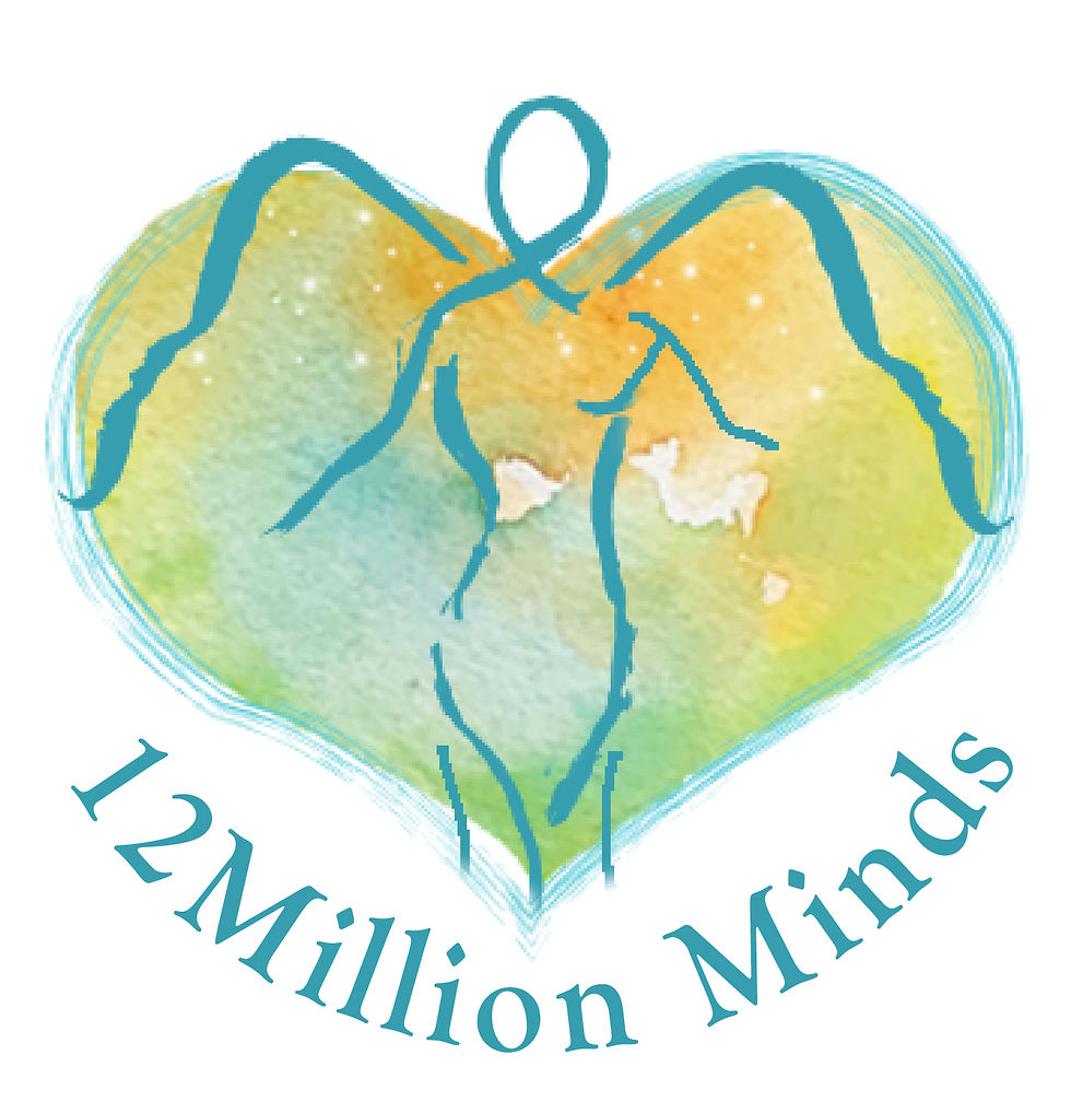
I was briefed that the latest logo was to be a particular set of colours, include an angel, and be totally unique. Not a problem at all, I got out my paints and started to work. Here is the final result, but I wanted to share with you the stages and reasoning for this design.
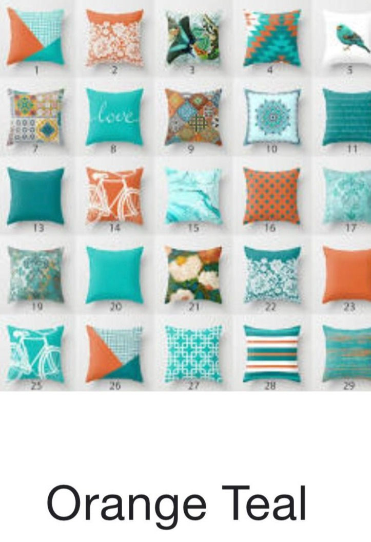
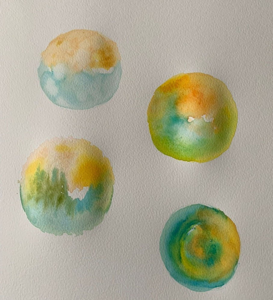

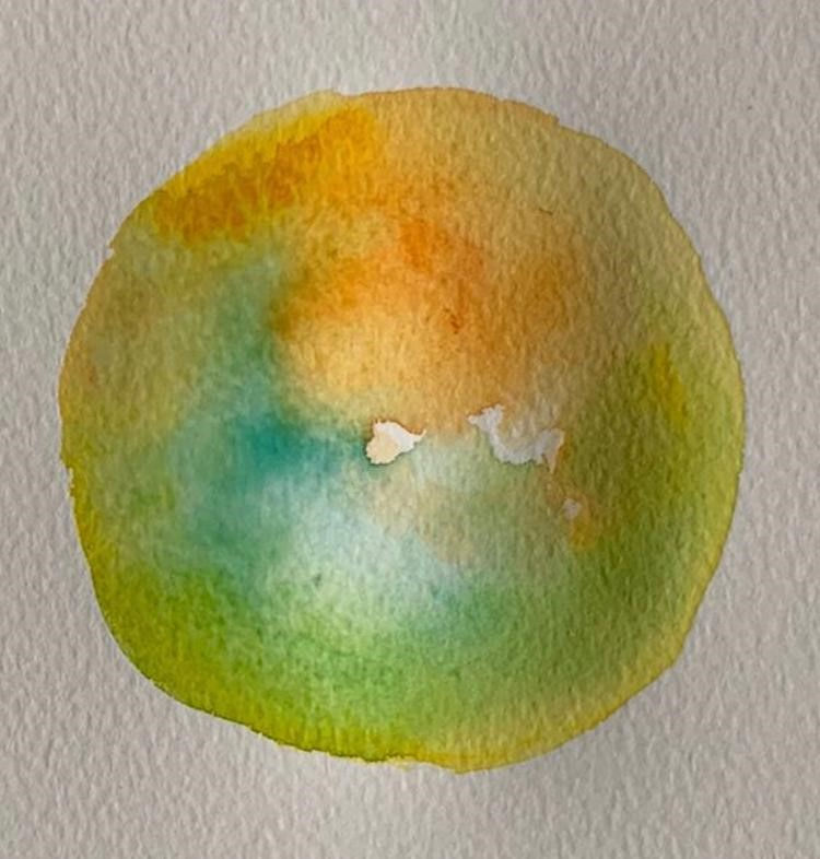
Some of the raw state imagery is shown here and also the colour inspiration that was sent to me. I really enjoyed playing around with and mixing the colours on the page. The angel went through a few changes of style but I could clearly see in my mind what I was hoping to create.
It always helps to have a starting point and some of this was the ethereal style illustration work that I had done on the book recently.
Once I started to manipulate the painted elements digitally it was much easier to tweak the lighting and colours so that it all sat beautifully together. Such an advantage to be able to re-colour on the spot and send screen shots as this greatly reduces time taken to get a positive result.
You can clearly see how the image has been flattened and evened out once the work was uploaded to the design package.

This is the final stage before I was asked to turn the circle into a heart. Easily done with some Photoshop magic, literally a magic wand tool.
However, what I wanted to add was that this logo was needed to replace one that I had been asked to tidy up a while ago due to the fact that it wasn't totally original.
What I had been initially sent was a request to redraw an existing logo. The original design, all be it lovely looking, had been generated from clip art. The issue with this is that someone or some other business can create a copy which could look like they align themselves with you. For this charity, a close by similar logo had popped up and this needed to be remedied.
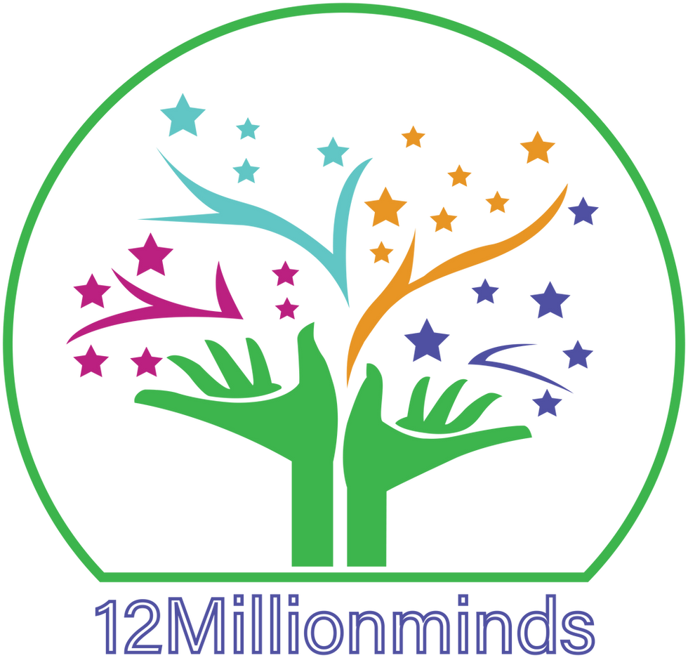
Here is the original, received initially as a fuzzy image, redrawn with vector art and the circle and text added. I had been asked to recreate the main elements so that they were clean looking and this logo gladly lasted for a while as the charity continued to flourish.
Very recently it was discovered that the identity needed to be changed and so, after discussion, submissions and tweaks, our lovely new uplifting logo was created.
So, a word of advice, stay smart and commission an original...a one off...something that says your brand all over and speaks to those with whom you wish to connect. Be wary of those who set themselves up with the offer of clip art. They may be a little more cost effective but nothing says who you are better than your brand identity and that is well worth the investment. It wont cost you the earth.


Comments